My Portfolio
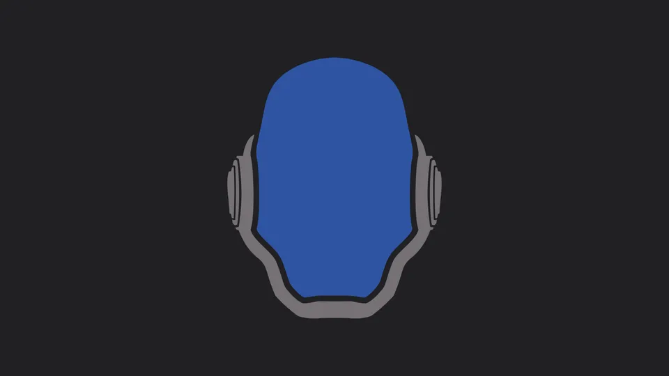
If you're are only here for the code then feel free to check it out on Github.
Tech Stack
As for the technologies used in this project:
- Nuxt a Vue based Full Stack framework.
- Nuxt Content module for managing the markdown based blog entries.
- Nuxt Image module for handling image optimizations.
- Nuxt Testutils modules is used to perform End-to-End, component and unit testing.
- Nuxt Sitemap module for generating a sitemap.
- Tailwind CSS a utility-first CSS framework.
- Font Awesome as icon library.
Continuous improvement is an essential part of the development process in every software project. Thus in order to streamline the deployment process, GitHub Action workflows are used to automatically build and publish the changes of each commit. Additionally, the Static Site Generation (SSG) feature of Nuxt is implemented to enhance performance and security by generating static files.
Logo
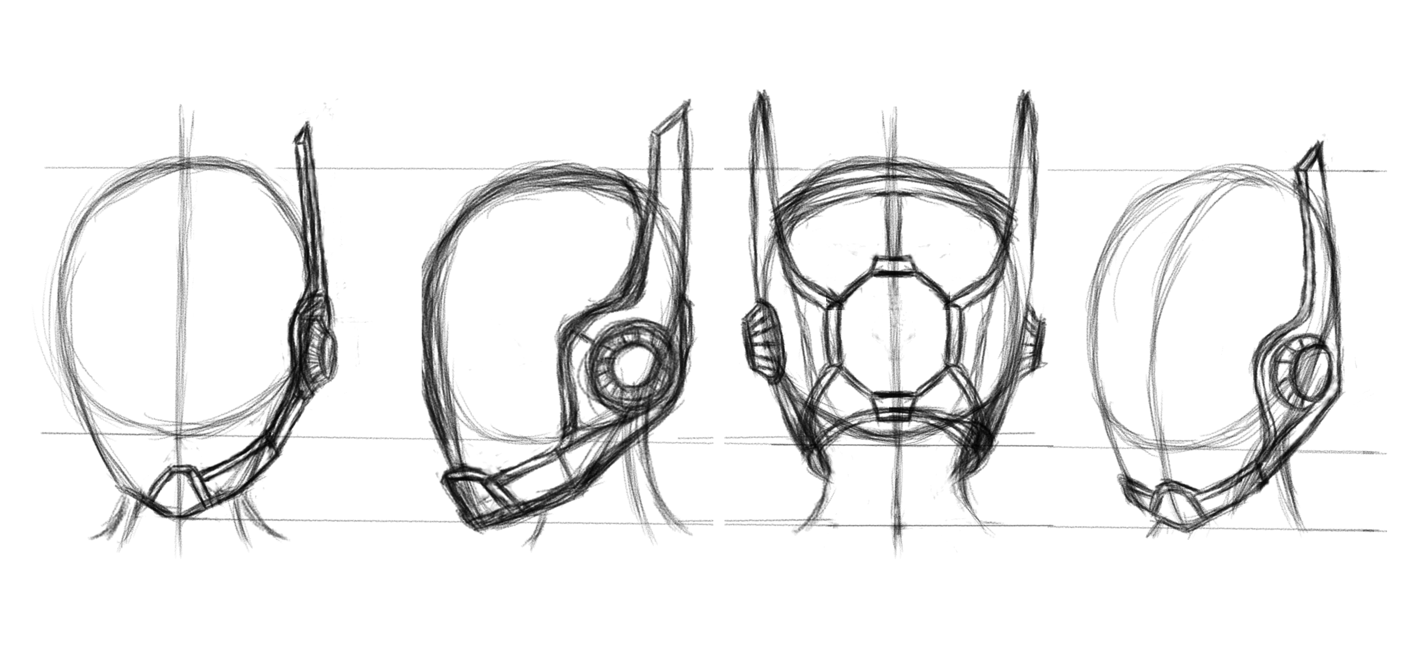
The logo design for Saiba Tenpura (translated as Cyber Templar) my alias is illustrated by a sci-fi themed helmet. The first step in the creation of it was to draw up a couple of sketches in Krita to get a sense for the direction I wanted to take it.
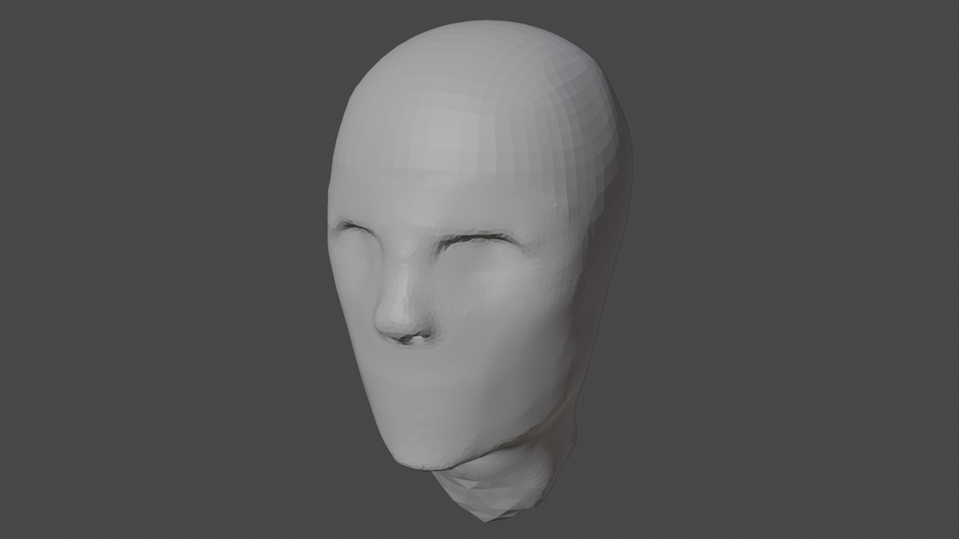
The next step was to turn the sketch of the helmet into a 3D model in Blender. I did so because I'm going to reuse the model for other projects in the future as well. I began by modelling a basic 3D head shape that served as reference for ensuring the dimensions are realistic.
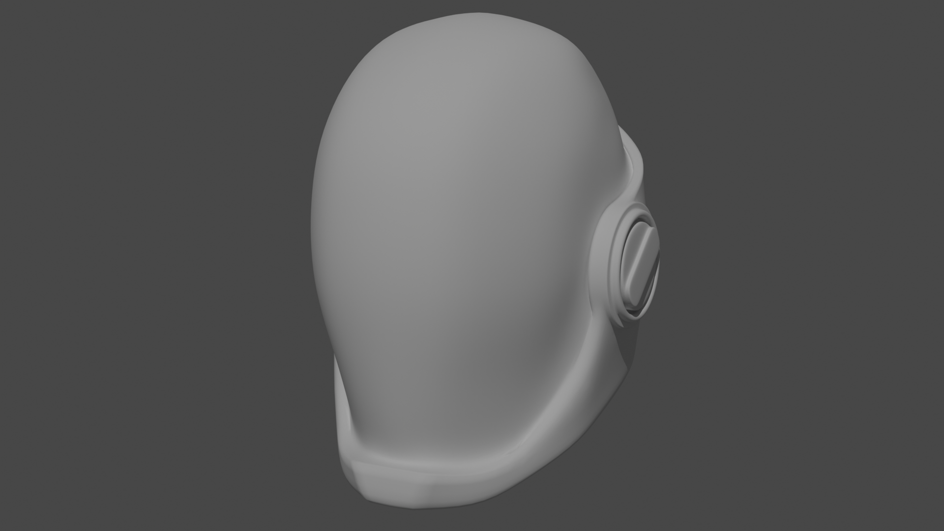
After that I actually went through a couple of iterations and deviated slightly from the original sketches before achieving something I was pleased with. I kept low on the details for now since my aim was to keep it minimalistic and more could always be added later on when they were actually needed.
Another benefit of using Blender is the Freestyle Line feature which provides the freedom to render an SVG of the model from various perspectives.
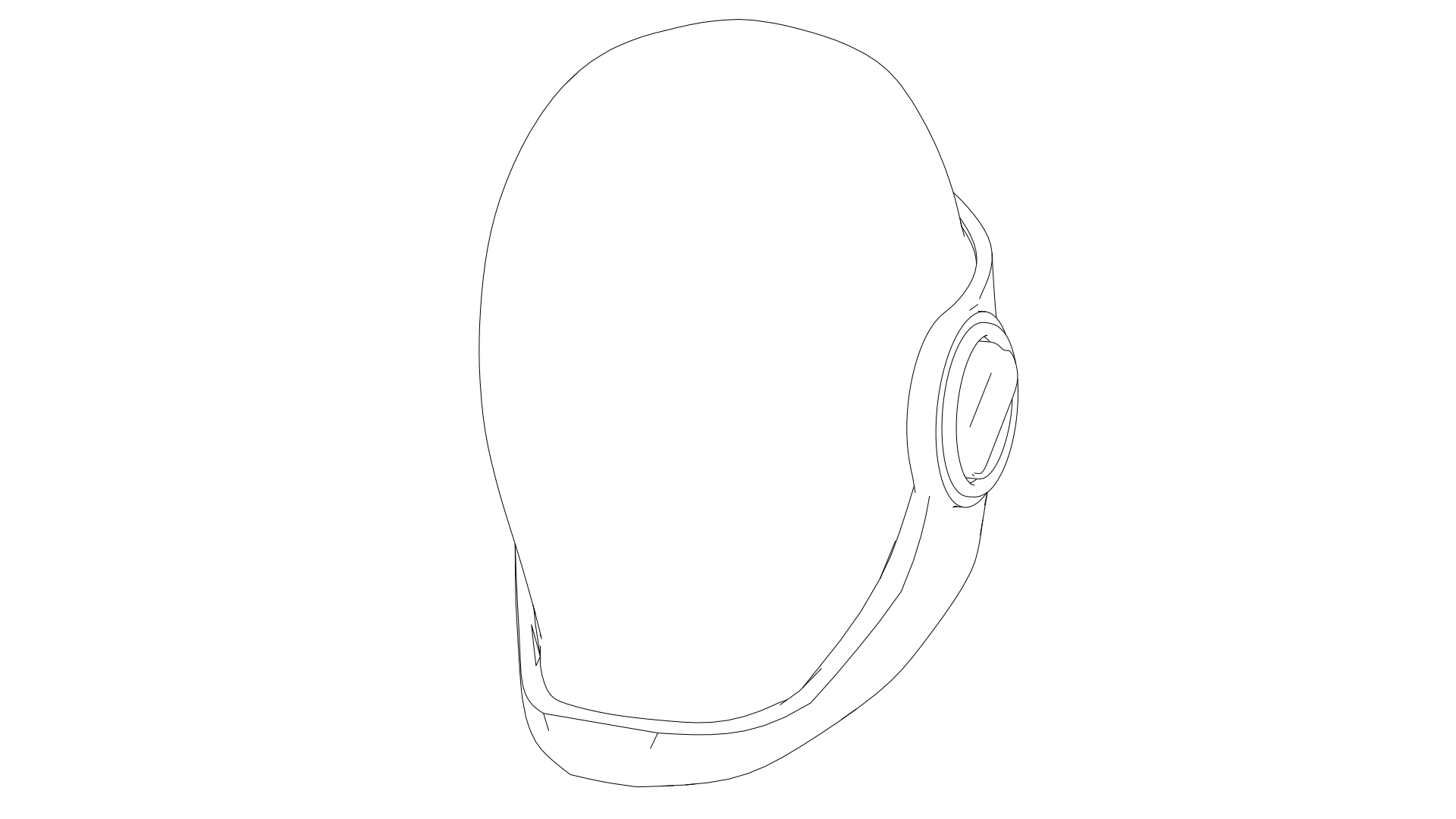
After rendering the SVG I transitioned to Inkscape, added colors, and made adjustments to the logo to make it more minimalistic to ensure readability, event at smaller sizes.
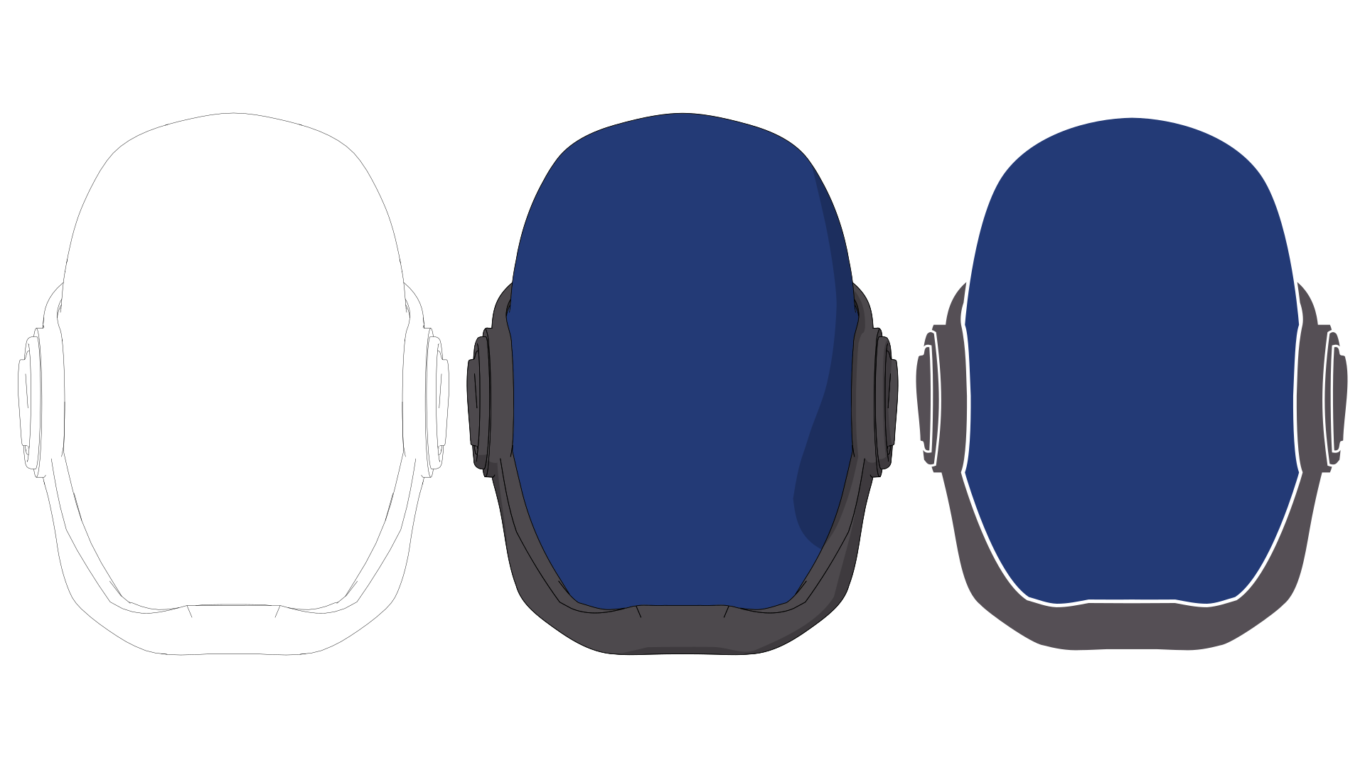
Future design iterations of the logo are planed to incorporate new details and adjustments, aligning with the overall continuous spirit of the portfolio.
Update (August 22, 2024)
In the end I decided to go through one more design phase for the logo to improve its overall quality but this time, I reversed my approach first conceptualizing the design and then creating a 3D model from scratch.
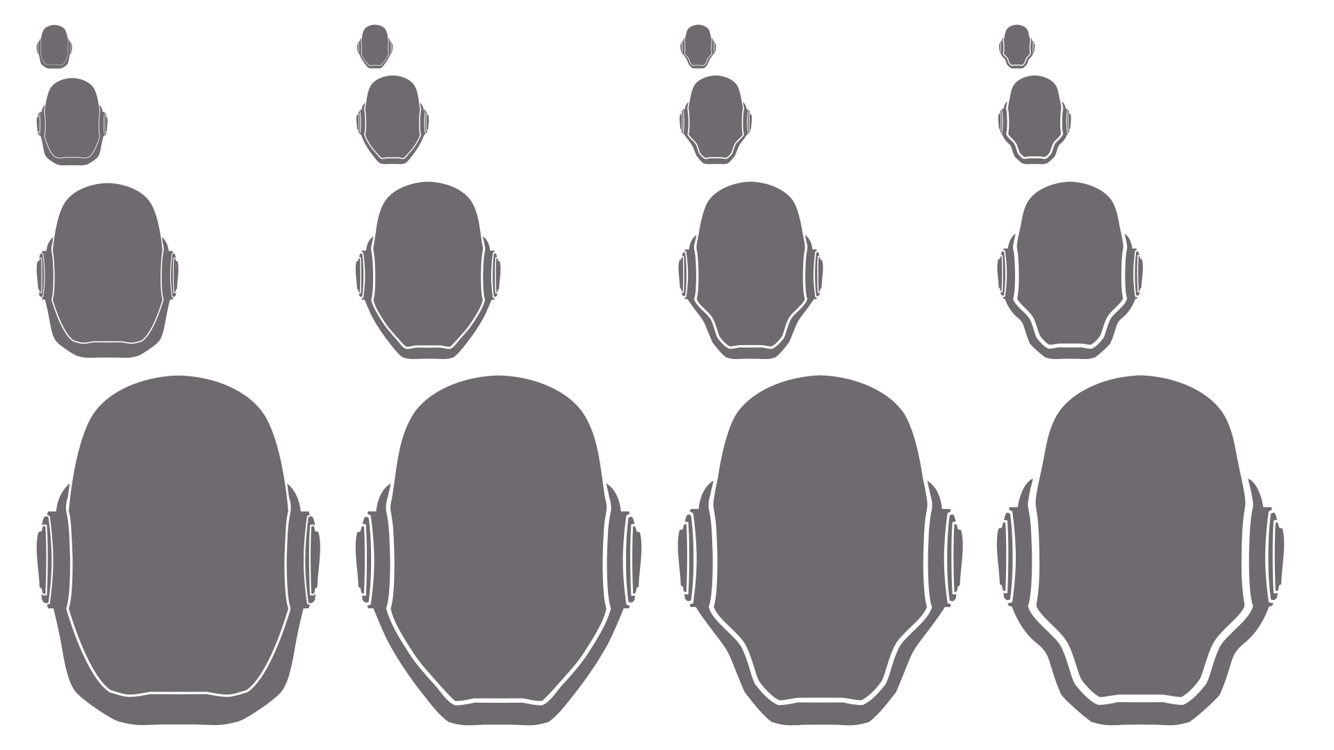
First of all I went through multiple iterations in Inkscape, refining each subsequent design based on my previous improvements, to refine the silhouette and make it more aesthetically pleasing. It took way more than four iterations of course, but I couldn't squeeze more into the screenshot.
Another issues was that the icon could become hardly legible on gray or dark backgrounds like window tabs in dark mode browsers. After experimenting with various color combinations, I settled on sticking with the original colors just significantly brighter.
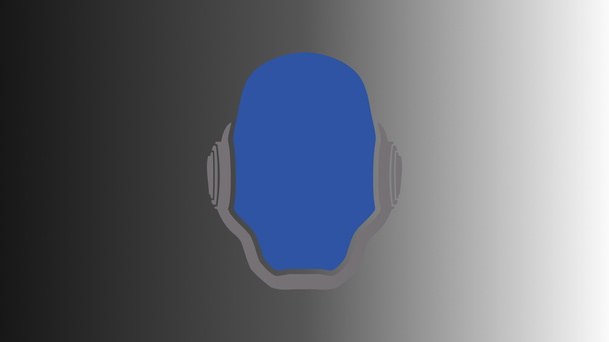
As you can see it may not excel in every situation, but the updated version is able to handle darker backgrounds way better than before. I also wasn't really willing to push the colors any further.
As promised, I also went back and a 3D model based on the revised logo by using the previously created references and parts from the original one.
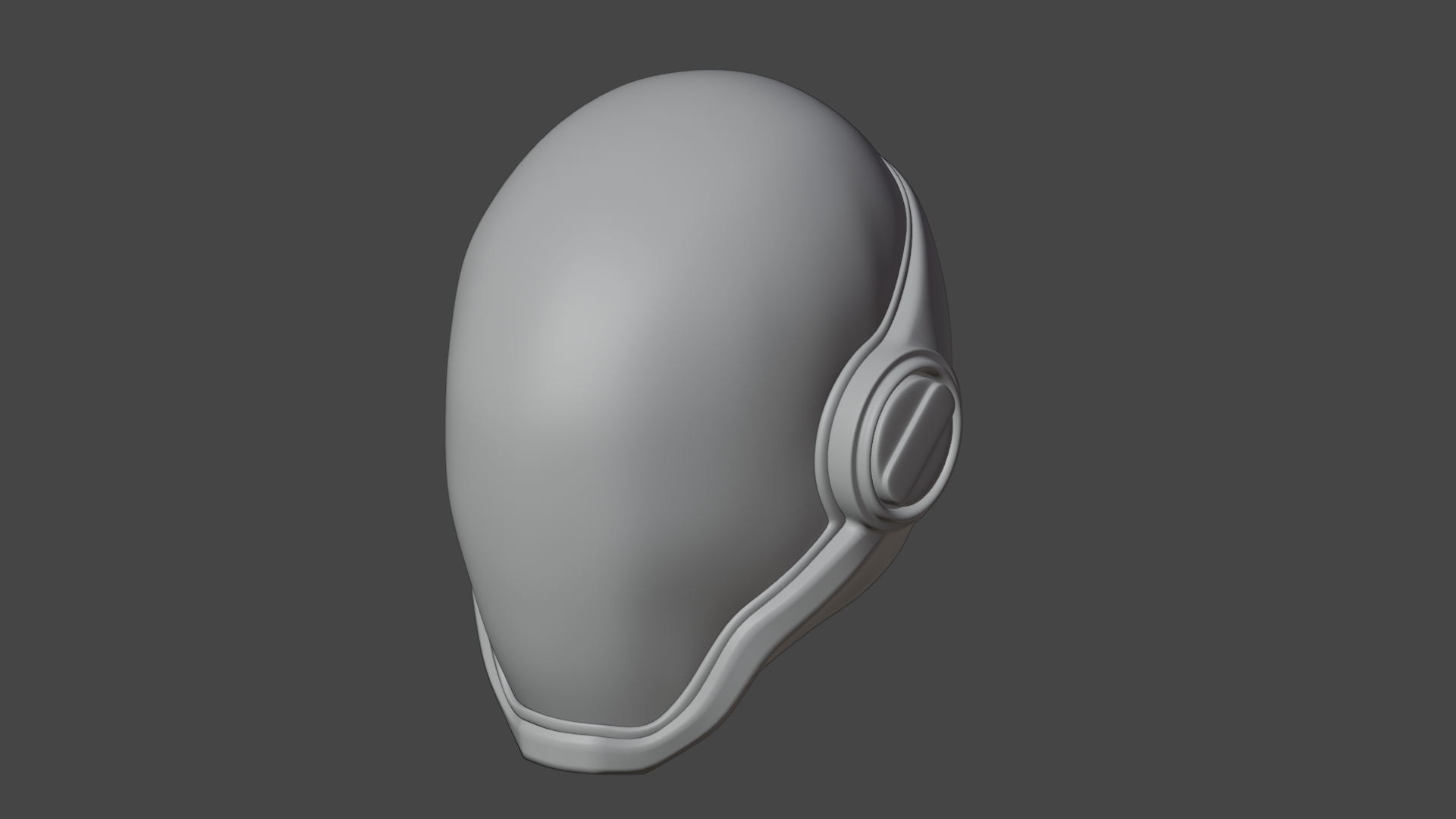
I then used it to create the image you can see on the landing page, but that's it for now, until the next iteration.